Clarity by Code: Building Brand Experience with Semantic HTML and CSS
Refining the Case Study Through Feedback
Following the development of the About Us page for the Saga V website, I refined my case study to reflect peer feedback that emphasized clarity, brand-alignment, and technical precision. The review process encouraged me to reassess how my layout decision communicated hierarchy, accessibility, and brand-tone across multiple devices. I revisited my semantic markup to ensure each element served a clear structural and experimental purpose. This reflection led me to clarify how my breakpoint logic supported content legibility in varied user contexts. By integrating peer insights, I strengthened the narrative flow of the case study and made the strategic rationale behind each design choice more explicit. The revision demonstrates my ability to evolve through critique, aligning technical skill execution with immersive brand-storytelling.
Ensuring Accessibility and Responsive Design
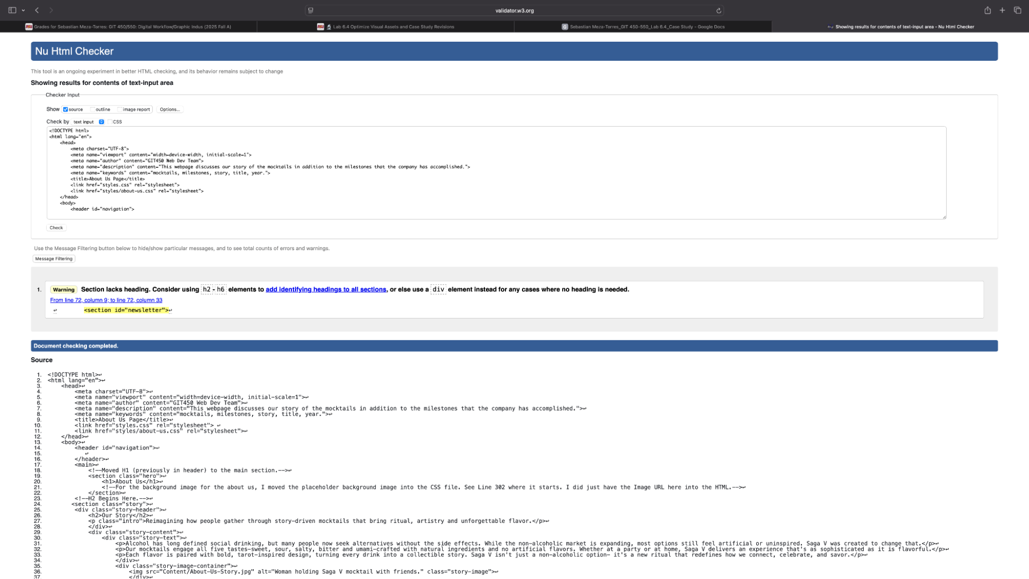
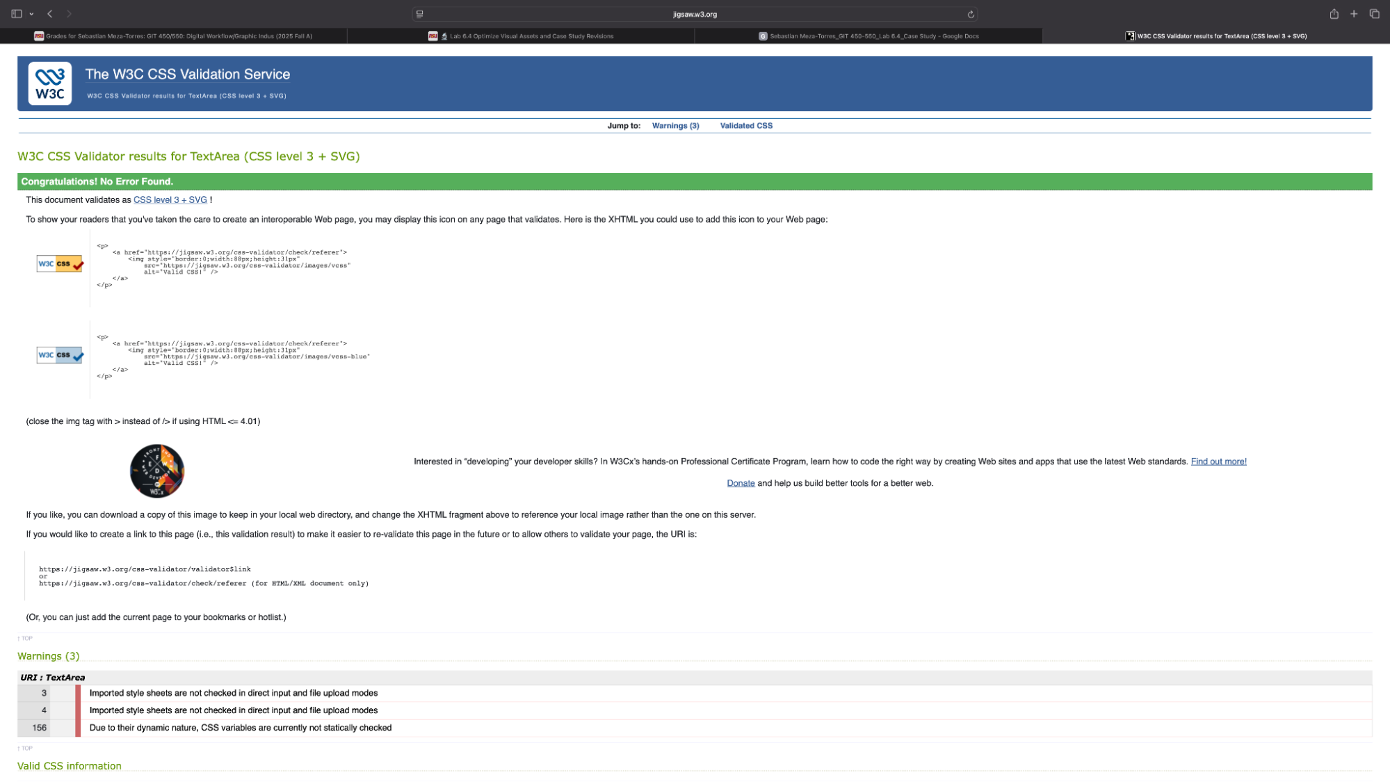
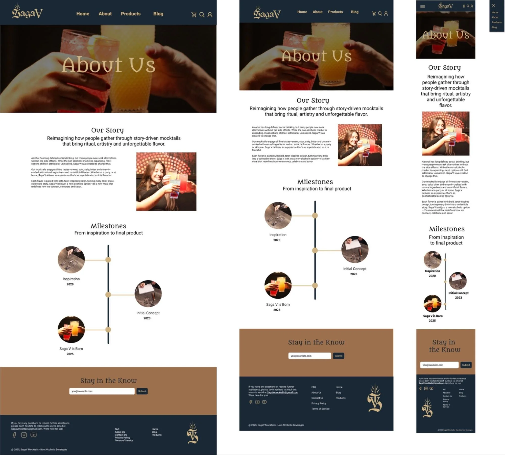
One peer from the web dev team highlighted the importance of testing and validating tools which aligned with my use of semantic HTML and responsive CSS to ensure accessibility and consistent layout behaviors across the three main breakpoints I implemented. This feedback reinforced my decision to prioritize clean, standards-compliant markup that could be used for assistive technologies. To support this, I used validator tools for HTML and CSS to ensure everything was structured semantically. Responsive behavior was tested across different devices (global styles/mobile, tablet, and desktop) to ensure that content was flowing correctly across each device screen. I also added appropriate spacing, font-sizes, layout structure, and image sizing to ensure positive user experience. These adjustments helped ensure that the design was not only visually consistent but also inclusive and adaptable to diverse user needs.
Designing with Symbolic Storytelling in Mind
Another peer from the content team praised the quality of the design, reinforcing my focus on symbolic storytelling through modular layout. As the web developer responsible for coding the About Us page, I translated these symbolic elements into clean code that preserved the emotional tone of the brand. I used meaningful tags and descriptive attributes to ensure that each section conveyed purpose, not just visually, but structurally. Interactive elements were coded in to feel intentional and intuitive, supporting the brand’s narrative without relying on heavy establishment. My goal as the web developer was to make the code itself part of the storytelling, reinforcing identity, clarity, and trust through thoughtful implementation.
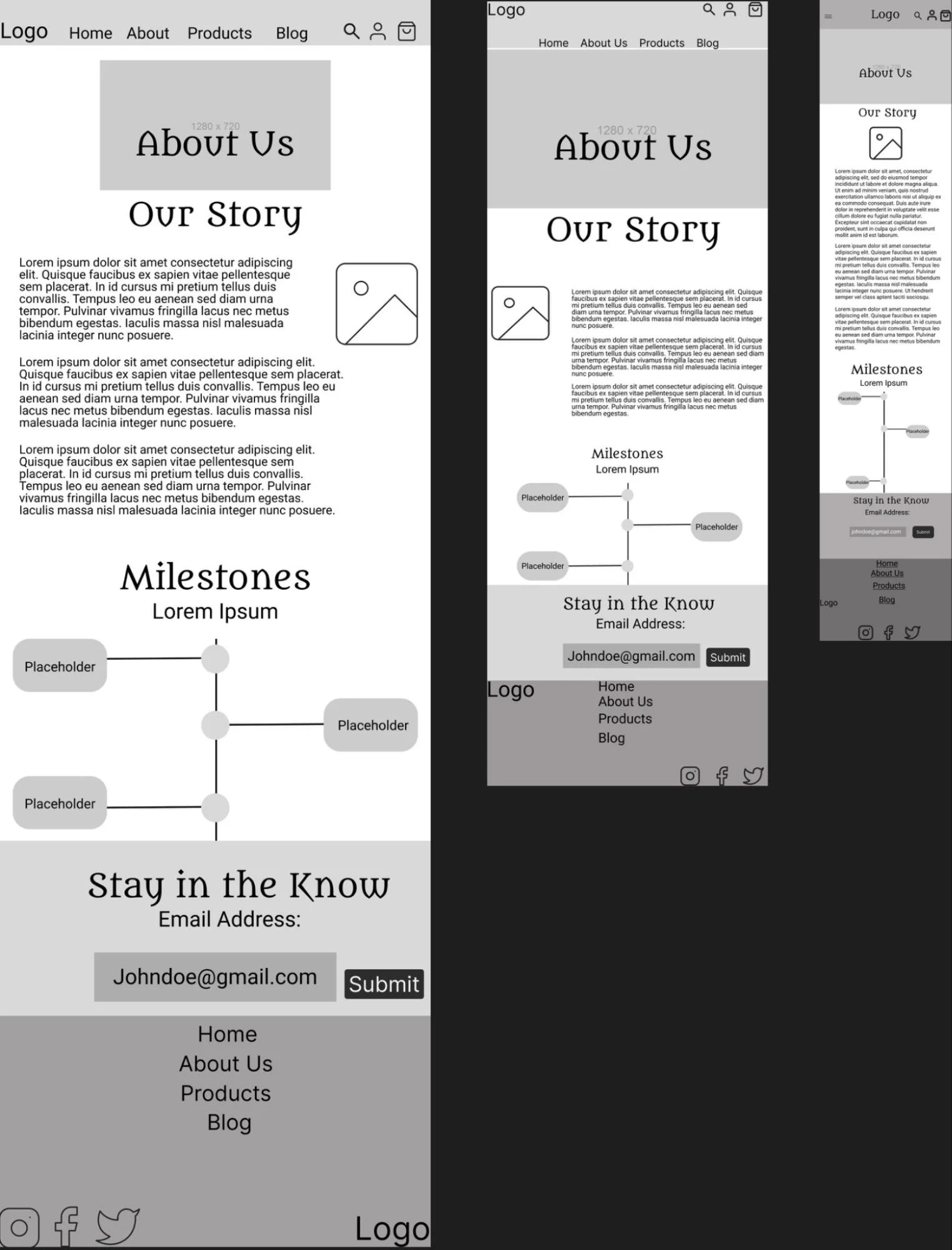
Staying True to Wireframes
Both peers from the content team and web dev team expressed no points of confusion, validating my commitment to wireframe fidelity and immersive brand presentation. I treated the wireframe mockups (low and high-fidelity) as a visual guide and a strategic blueprint. I coded each section with careful attention to add purpose and content structure, ensuring the final implementation mirrored the intended flow and tone of the brand. Minor adjustments were needed for accessibility purposes but I added those minor adjustments without compromising the original design of the wireframes. This disciplined approach allowed me to preserve clarity and intent of the wireframe while delivering a brand-consistent experience.
Confirming Strategic Effectiveness
The feedback from the content team and web dev team confirmed that my design decisions were not only technically sound but also strategically effective in supporting Saga V's narrative and user experience goals. This validation showed that my choices around semantic HTML/CSS were not functional decisions but strategic ones that further advance the brand’s storytelling and usability. By aligning technical precision with brand-driven outcomes, I demonstrated both accessibility and narrative immersion. This reinforced my ability to design solutions that serve immediate user needs while also supporting long-term brand objectives.
Delivering a Cohesive, Brand-Aligned Solution
This revised case study demonstrates my ability to integrate accessibility, responsive design, and semantic clarity into a cohesive solution that supports both usability and brand narrative. I focused on translating strategic design intent into clean markup that reinforced Saga V’s identity. I ensured that each coded element contributed to a seamless experience, balancing both technical precision with emotional resonance. The final implementation reflects a thoughtful blend of accessibility, clarity, and brand-storytelling delivered through standard-compliant code and responsive behavior. This project affirmed my ability to collaborate, adapt through challenges/ feedback, and deliver a solution that feels intentional, inclusive that is aligned with the brand’s mission, closing the loop between concept, execution, and experience.


